
BaltimoreCity.gov Redesign
Client: Baltimore City Office of Information Technology
Prelude
Redesigning the Baltimore City website was one of the most ambitious and rewarding projects I’ve ever worked on. It pushed me to grow in ways I hadn’t anticipated, both professionally and personally. I forged lifelong friendships with my colleagues and learned lessons that will stay with me forever—like the importance of stepping up to lead when no one else will and breaking down silos before they take root.
This project wasn’t just about creating a website; it was about building a tool that could make a meaningful difference for Baltimore residents, including myself. More than anything, this experience reaffirmed what I care about most: contributing to my community in a tangible way. I feel deeply proud to have played a part in something so impactful, and I look forward to the day this project is published and begins serving the people it was designed for.
Overview
The Baltimore City website redesign was a transformative project aimed at improving usability and accessibility for a diverse audience while staying aligned with stakeholder needs. This effort sought to create an online platform that truly serves the community, fostering a better connection between community and the city.
My Key Contributions:
Created intuitive interaction patterns: Designed user-friendly components in Figma to streamline development and testing, ensuring a seamless handoff between design and engineering.
Fostered team collaboration: Initiated weekly ceremonies to break down silos between development, design, and research, cultivating stronger team cohesion and communication.
Shaped the website structure through research: Conducted user interviews and card-sorting exercises to design an intuitive information architecture, including primary navigation and models for secondary navigation.
Delivered stakeholder-driven solutions: Proposed alternative secondary navigation layouts to meet the unique needs of stakeholders while maintaining usability.
Developed rapid prototypes: Created live-like prototypes for testing, enabling faster iterations and more informed design decisions.
Outcome:
The result was a user-centered, adaptable website design that balanced stakeholder priorities with community needs. This project not only improved accessibility and usability but will also (hopefully when launched) contribute to a more engaging and impactful online presence for Baltimore City.
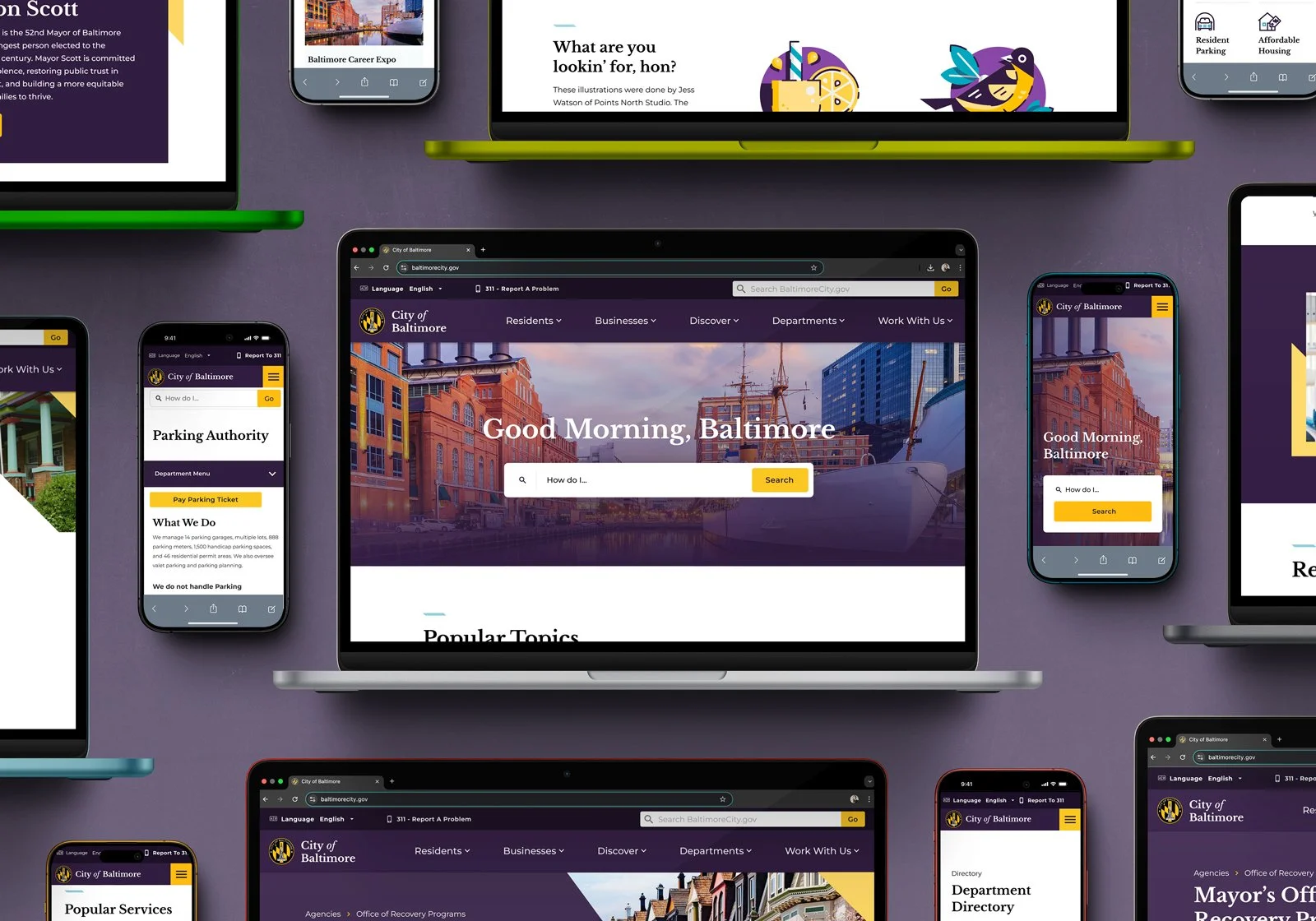
Product Preview
As with many projects, the development of this one has been stalled, so for now I can only show you a demo walkthrough of the prototype we used for testing in the video below.
Alternatively, you can go chaos mode and break my imperfect prototype in Figma through the link below using the same password used to get onto this page. It has been broken many many times before.
Discovery
When I joined the project, I quickly identified a few critical gaps that needed to be addressed. Although the team had already been working for a few months, no user personas had been developed yet. Recognizing their importance, I took the initiative to create them.
To ensure the personas truly reflected the diverse experiences of Baltimore City residents, I collaborated with team members to interview people from a wide range of neighborhoods. Given the socio-economic diversity of the city, it was essential to approach this process with sensitivity—carefully considering the types of questions we asked and avoiding assumptions.
We developed ten distinct user personas to represent the key audiences for the Baltimore City website. These included both city employees who would be managing and editing the site, as well as residents whose demographics closely align with Baltimore’s diverse census data. Below are six of those personas.
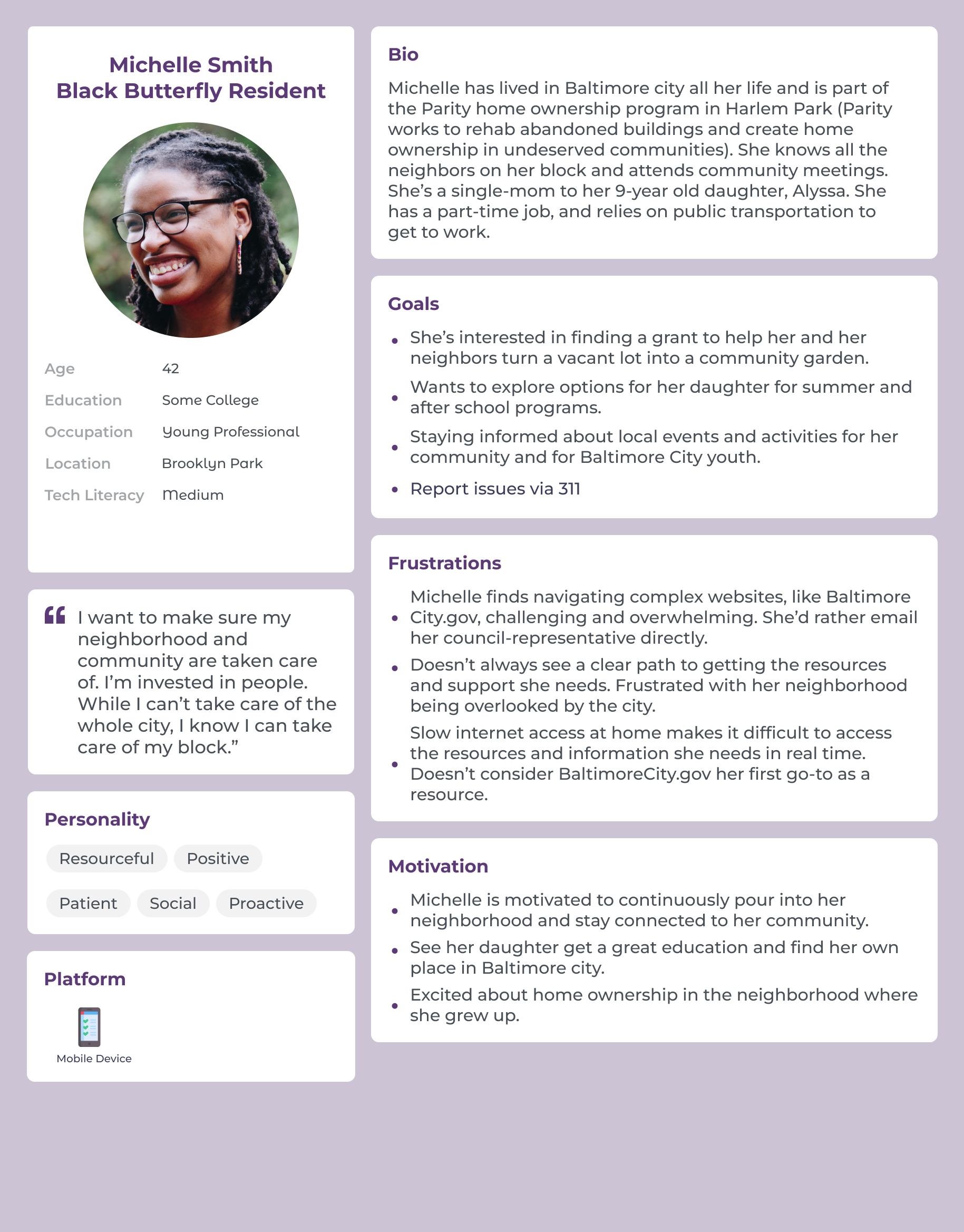
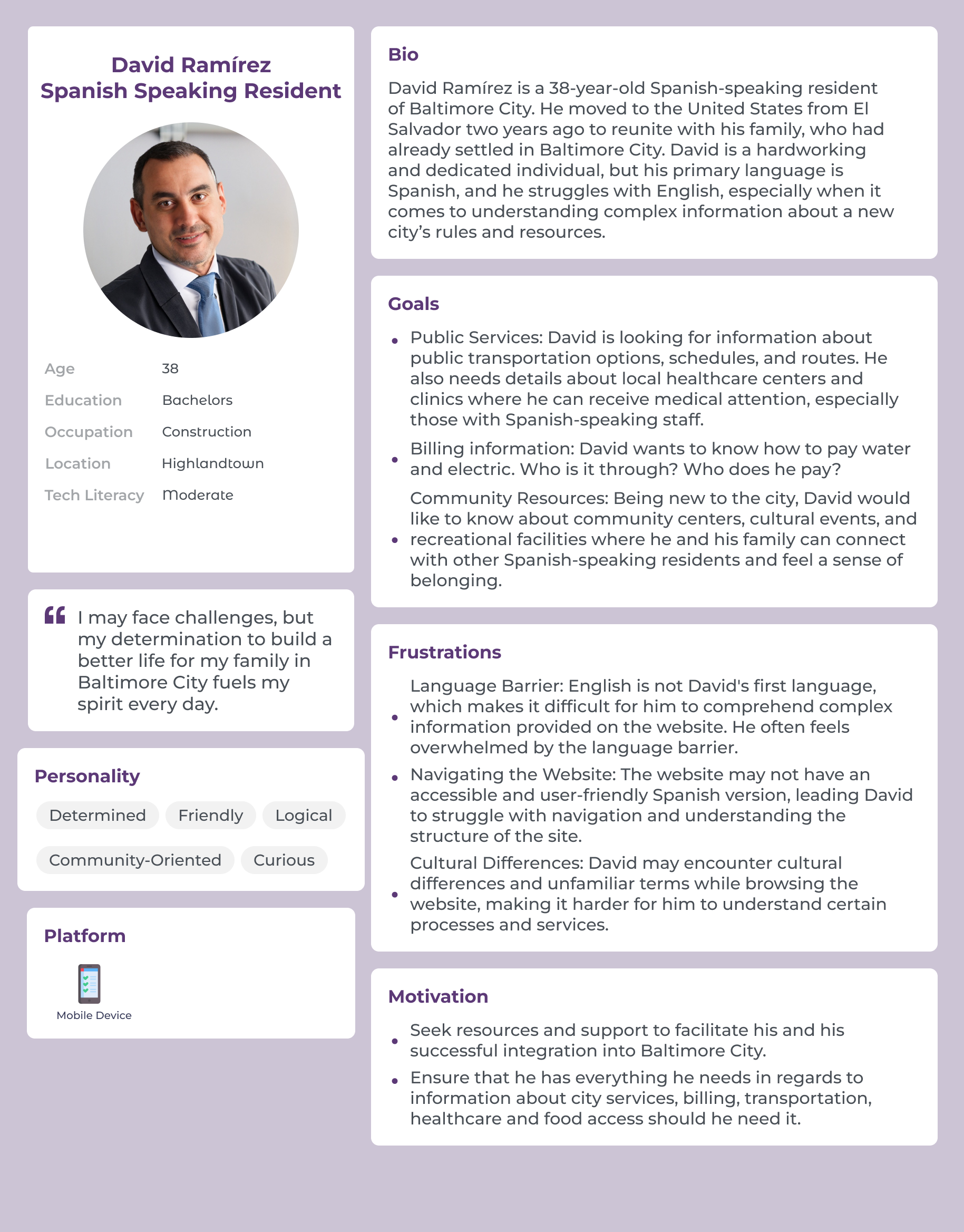
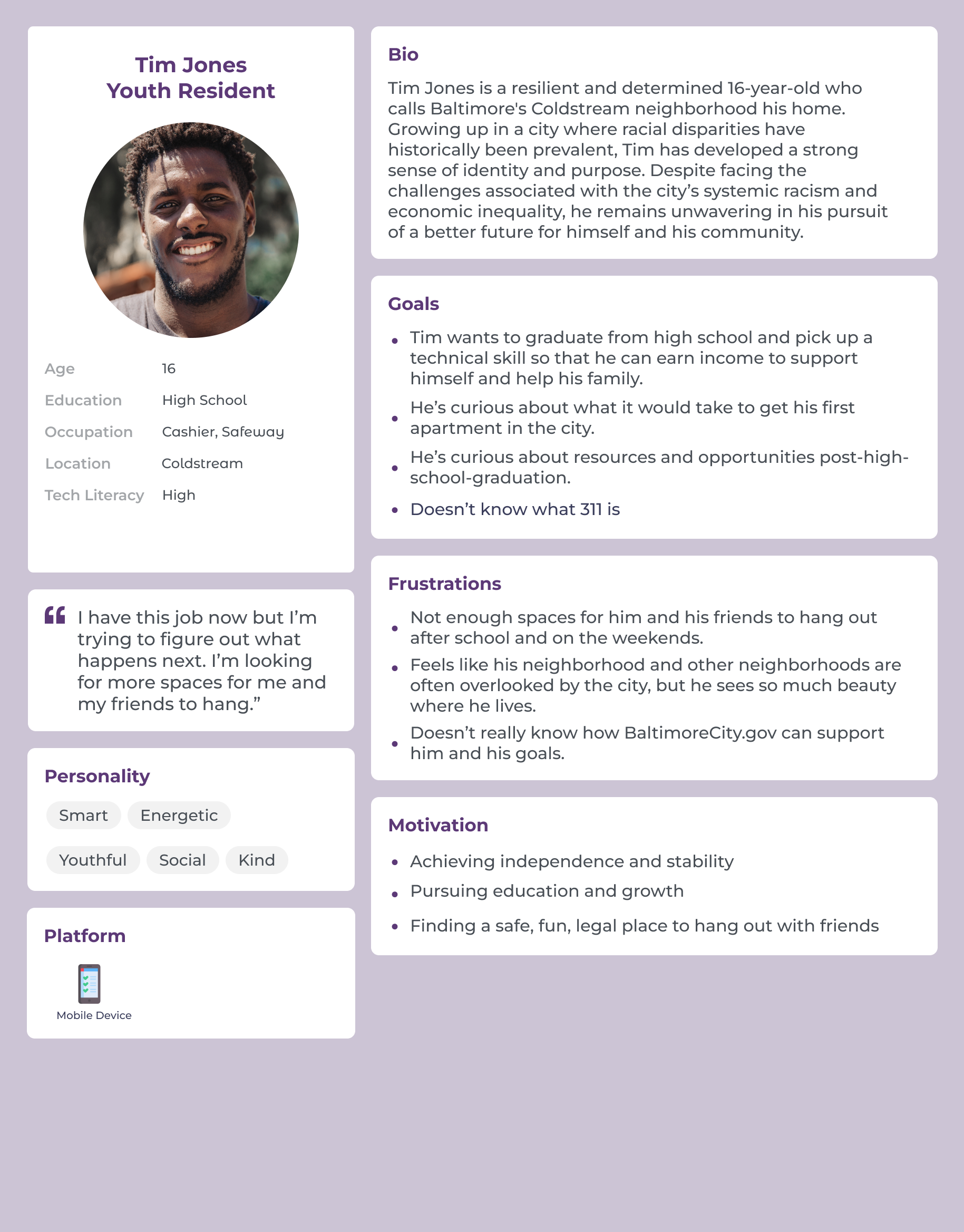
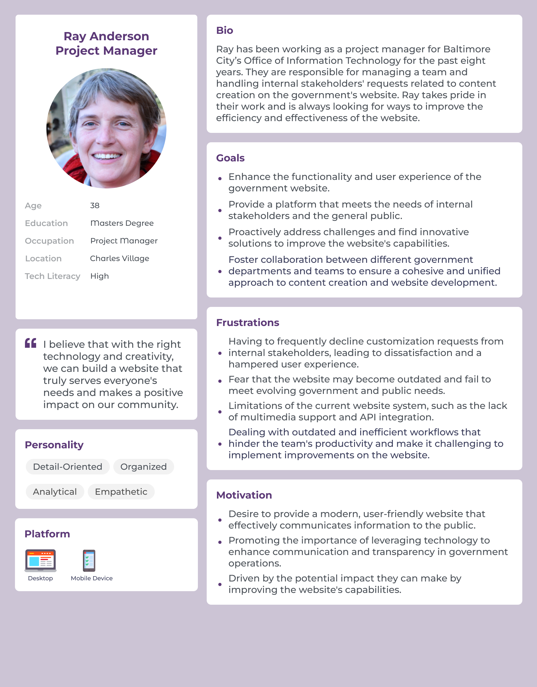
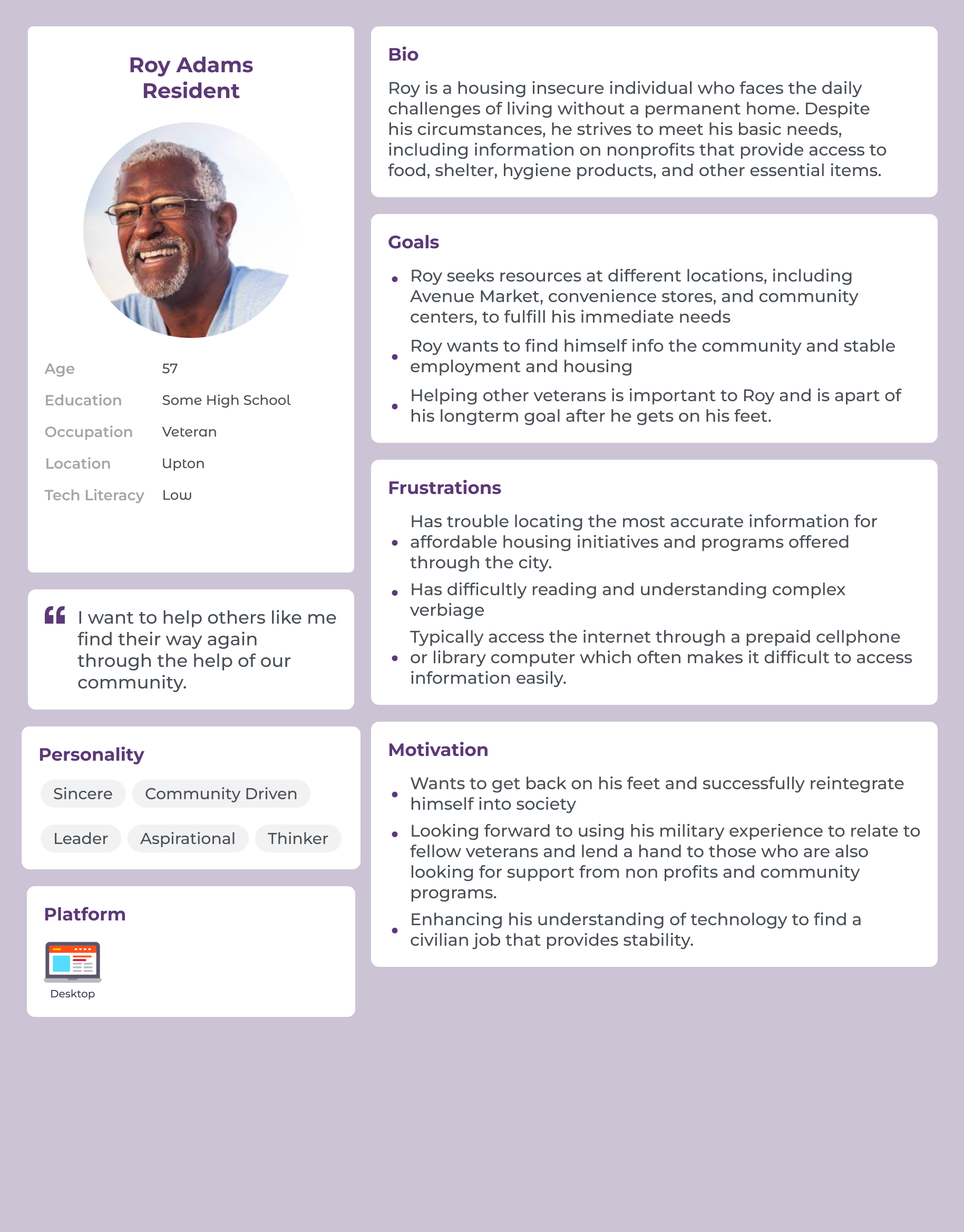
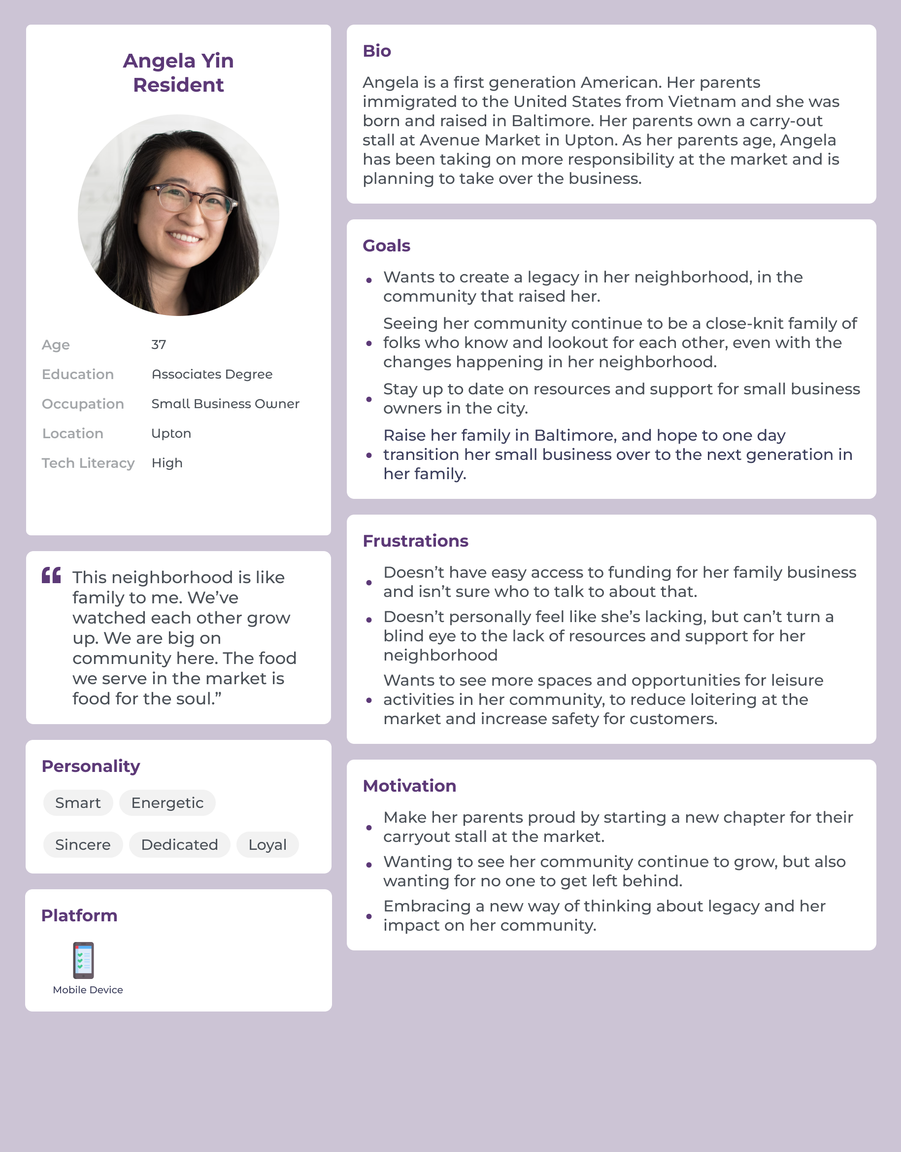
Fortunately, our team was both diverse and empathetic, fostering open communication and constructive feedback throughout the process. We identified sample populations by reaching out in libraries, coffee shops, gyms, bus stops, and group chats. We also utilized social media and placed ads to widen our reach. Every step of the way, we were deliberate in creating an intentional and inclusive pool of participants to inform our user personas.
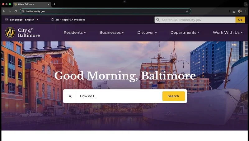
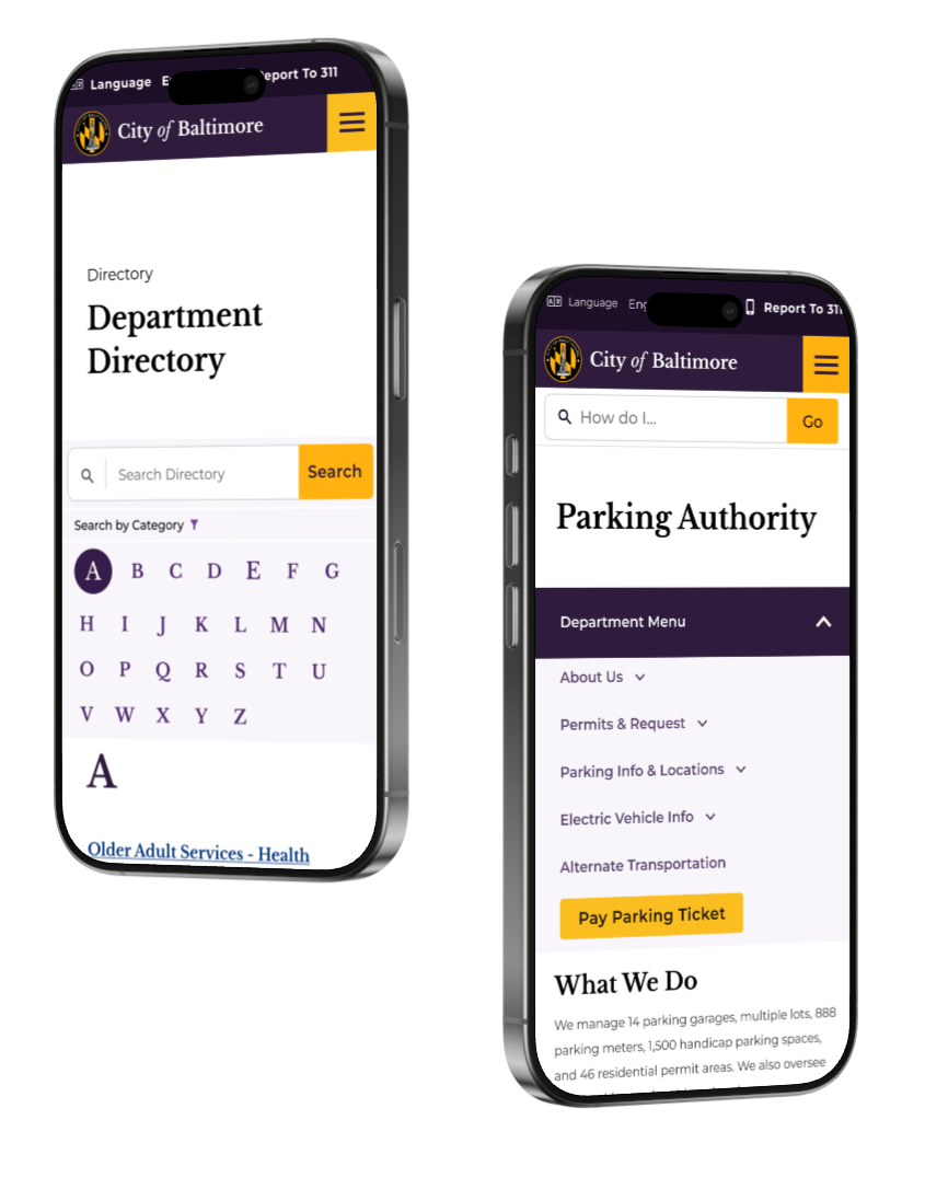
Header Navigation Updates
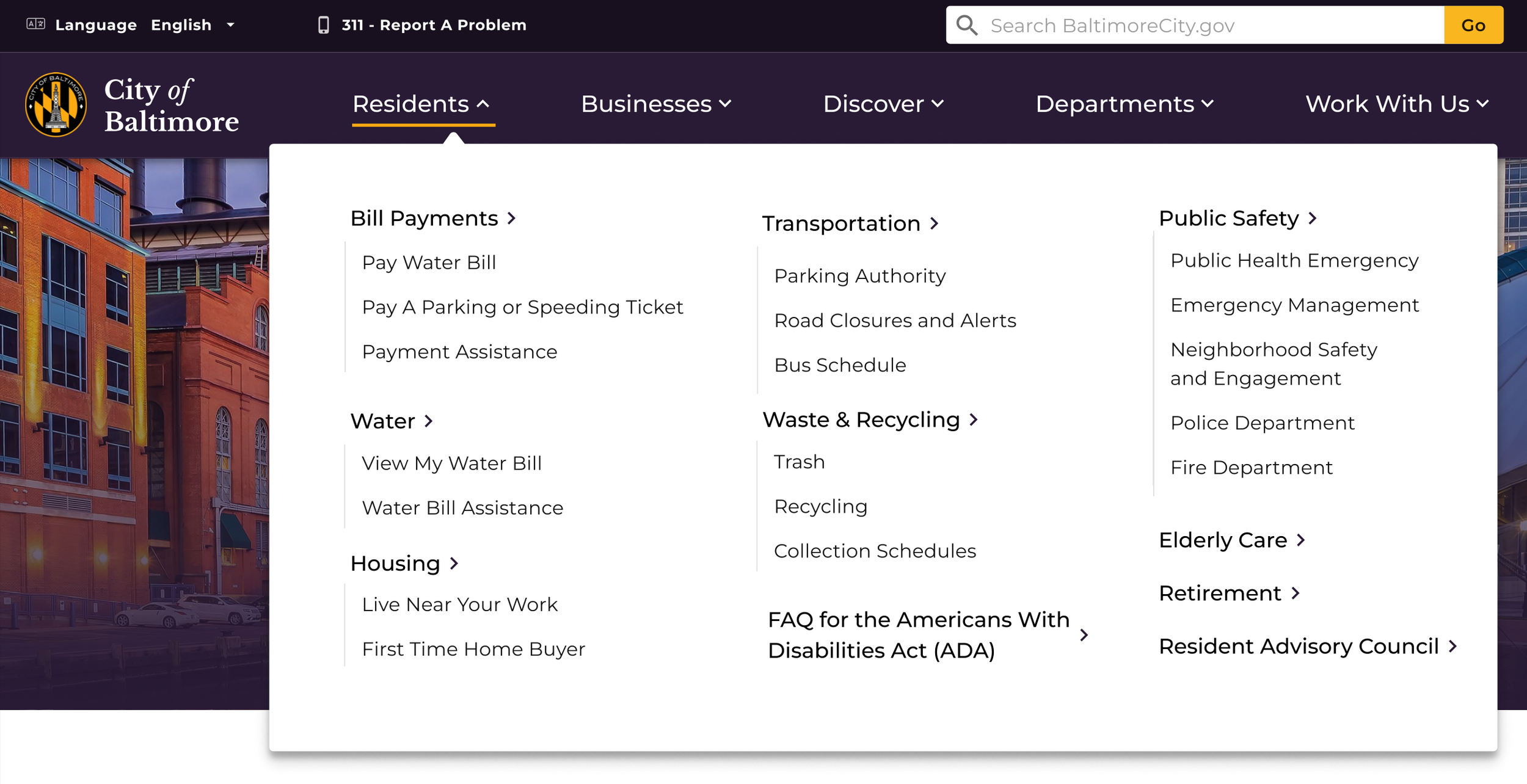
The old version (or current version as of 2024) of the website had a very… vague navigation, which many users during initial testing found to be incredibly confusing. I owned the redesign of the navigation, and worked diligently with the research and content teams on card sorts to ultimately come up a literal user-based navigation. It is organized by residents, businesses, visitors, departments, and city job seekers. I also created the interactions, as well as the mobile interface for this navigation.
Desktop

Mobile
Old Design
Updated Design
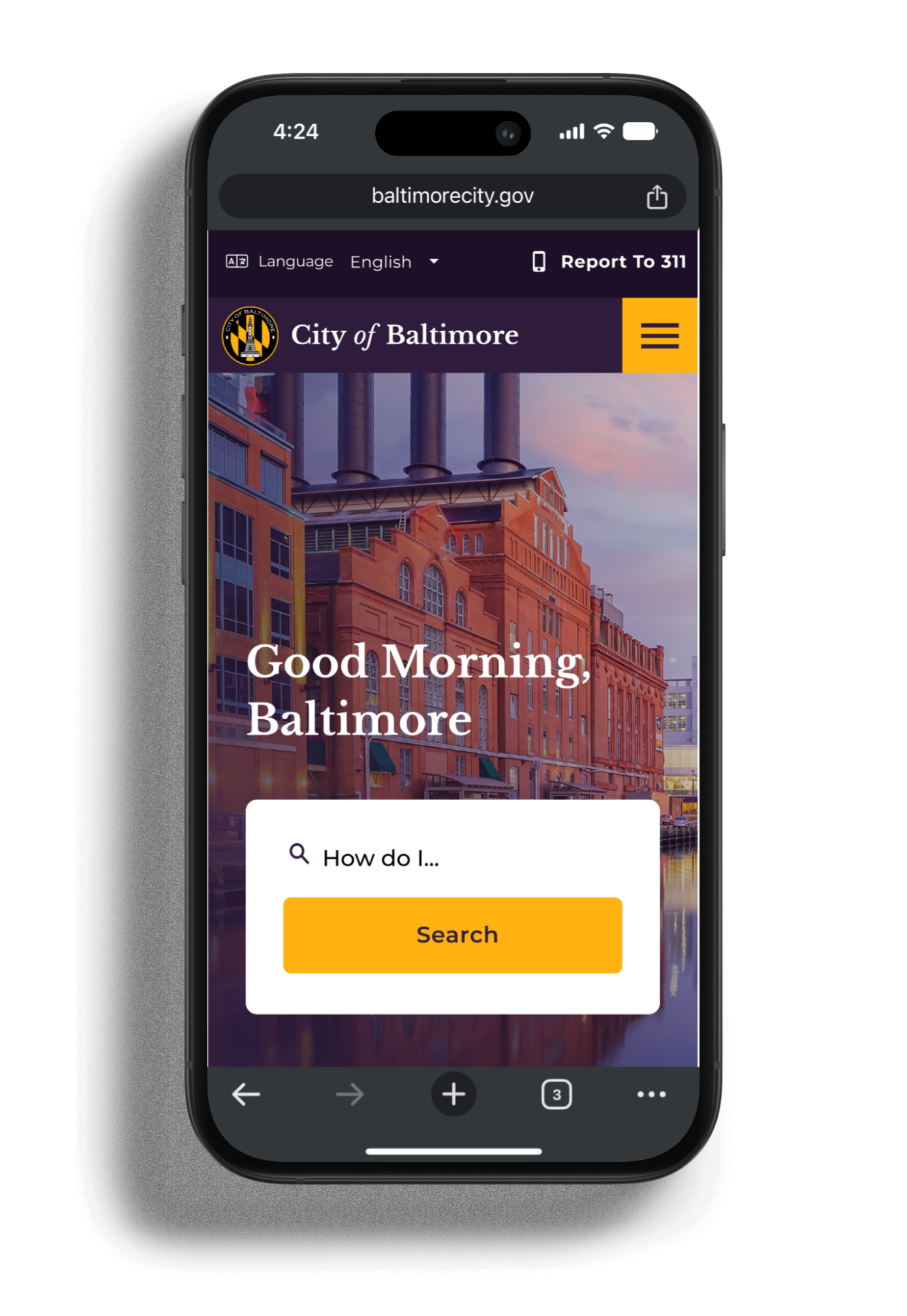
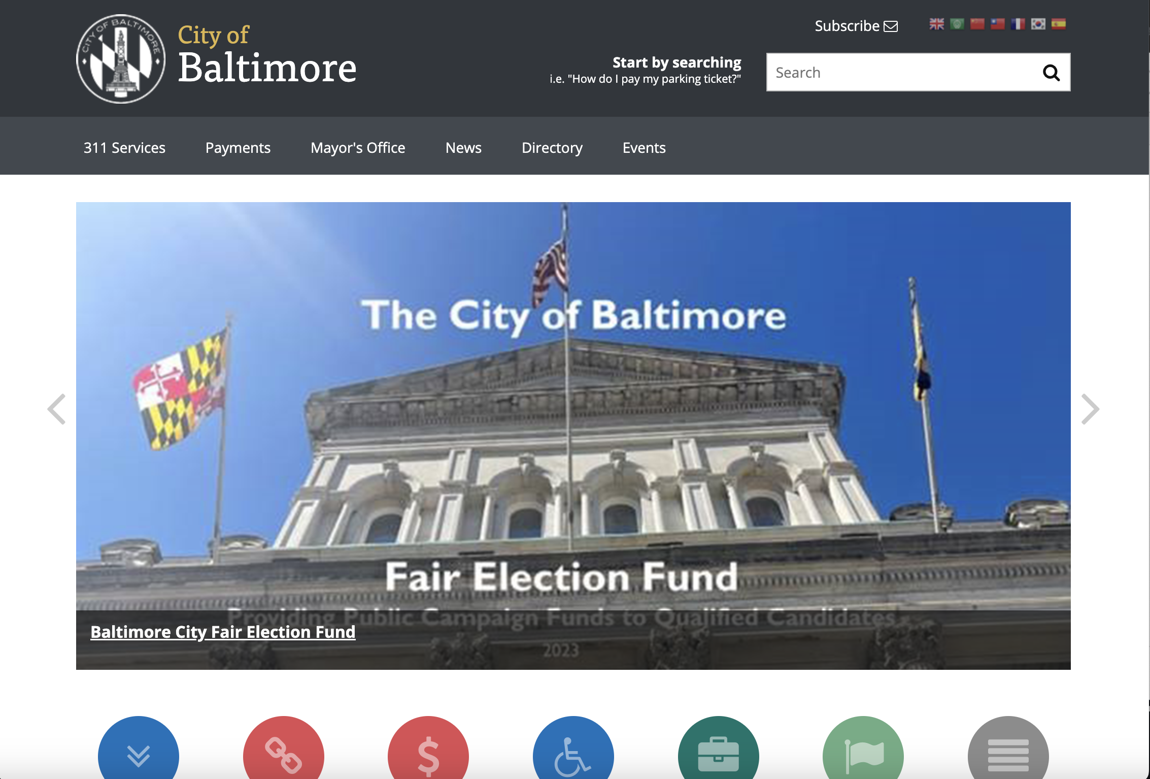
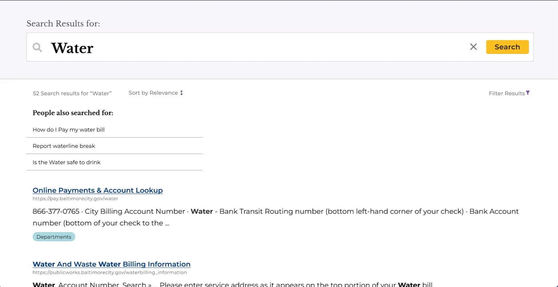
Designed to Search
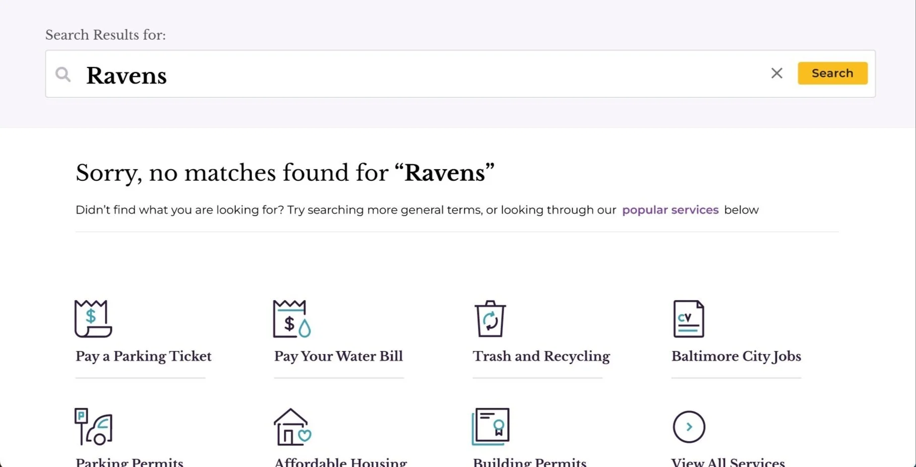
I played a key role in developing the search feature for the website. Noticing that users often relied on the search bar, I advocated for keeping it in both the header and the landing page to ensure continuity and ease of use. I also prioritized making the search bar highly visible to enhance accessibility for all users, and ensuring the homepage search was lower down on the mobile screen for ergonomic use. Additionally, I worked with the design and research teams to create a fallback system. If a search didn’t yield results, we provided recommendations using keywords through elastic search or displayed popular topics to guide users effectively.
Department Pages & Secondary Navigation
I worked on the department page designs, content organization, and navigation. One of the major challenges I faced was meeting the client’s request to exclude side navigation on internal department pages, which required rethinking the typical navigation structure that users are accustomed to on government websites. To align with the client’s idea of limiting the number of navigation items departments could include, I designed a solution that balanced usability with their requirements. I ensured the department title remained sticky at the top of the page so that users would still know which page they were on within the city’s website. This approach was approved by the client.
I addressed the issue of city residents frequently being confused about where to pay parking tickets, water bills, or 311 fines. Many people didn’t realize these payments needed to go through the Department of Collections, not the individual departments like the Parking Authority or the Department of Public Works. I added buttons for popular topics like “pay parking ticket” into the secondary nav in order to guide users directly to the correct payment page. This solution significantly reduced confusion and the volume of phone calls to departments, and it proved highly successful in testing.
Conclusion
There are many more pieces to this project to showcase, so feel free to reach out if you'd like a more in-depth walkthrough.
Team Credits
Project Management: Felix Gilbert (Prime), Kendra McCarthy, Meek Dual, Kendra Neely
Research: Gray Dionne, Claudia Gomez-Morales, Johnny Luce
Content: Teri Perona, Kristen Bowes
Design: Jess Watson (Creative Director) Derrell Elcock, Myself
Development: Will Birdsall (Lead), Pream Totaram, Mike Broyles, Rafiq Muntaqim